> For the complete documentation index, see [llms.txt](https://tech.x2bee.com/llms.txt). Markdown versions of documentation pages are available by appending `.md` to page URLs; this page is available as [Markdown](https://tech.x2bee.com/dev-guide/developer-guide-en/pjt-prepare/ui-ux-guide/style-guide.md).

# Style Guide

The X2BEE 3.0 BO system UI/UX guide is designed to effectively reflect the customer's brand identity. It provides standards for applying an X2BEE customer's identity, and was written to achieve the following expected effects.

1. Improving the user experience and increasing user satisfaction
2. Presenting approaches and guidelines for improving the user experience
3. Saving the cost invested in UI/UX development and management

#### Scope of Application <a href="#undefined" id="undefined"></a>

Online commerce BO systems based on the X2BEE 3.0 solution

* Maintains a consistent identity by adhering to usage rules together with the elements of color, typography, shape, layout, and icon.

| **Color**                                                                                                                                                                                     | **Typography**                                                                                                      | **Layout**                         | **System icon**                                                              |
| --------------------------------------------------------------------------------------------------------------------------------------------------------------------------------------------- | ------------------------------------------------------------------------------------------------------------------- | ---------------------------------- | ---------------------------------------------------------------------------- |
| <p>Key colors</p><ul><li>Primary color</li><li>Secondary color</li><li>Grayscale</li><li>Alpha</li></ul><p>Usage</p><p>Point colors</p><p>System Colors</p><p>Palette</p><p>Accessibility</p> | <p>Typeface</p><p>Type Scale</p><ul><li>Font size</li><li>Font weight</li><li>Line height</li></ul><p>Hierarchy</p> | <p>Header</p><p>Nav</p><p>Grid</p> | <p>Base</p><p>Selections</p><p>Arrow</p><p>Info</p><p>Common</p><p>Ohter</p> |

***

### Color <a href="#color" id="color"></a>

Composed of colors optimized for digital UI, based on colors that represent the customer. Maintains readability and visual consistency in the user environment by following color-contrast and accessibility standards (WCAG).

* Primary Color: used for key UI components (buttons, active states, etc.)
* Secondary Color: used for supporting components such as filters and chips
* Grascale: colors used for background and text contrast
* Alpha: composed of staged transparency levels
* Gradient: divided into Light, Main, and Bold

#### Usage Guidelines <a href="#undefined" id="undefined"></a>

* Use the Color Palette in 5 steps, from light to dark
*

***

### Typography <a href="#typography" id="typography"></a>

#### Typeface <a href="#typeface" id="typeface"></a>

* Default typeface: Pretendard
* Alternative typefaces: Nanum Gothic, Public Sans, IBM Plex Sans

#### Type scale <a href="#type-scale" id="type-scale"></a>

| **Style**  | **Size** | **Font weight** | **Line height** | **Letter spacing** | **Usage**                       |
| ---------- | -------- | --------------- | --------------- | ------------------ | ------------------------------- |
| Main Title | H5       | 16px            | 700             | 26px               | Used for menu/page-level titles |
| Sub Title  | H6       | 14px            | 700             | 24px               |                                 |
| Body       |          | 12px            | 600             | 22px               |                                 |
| Body1      |          | 13px            | 400             | 24px               |                                 |
| Label      | Large    | 24px            |                 |                    | Buttons                         |
| Medium     | 20px     |                 |                 |                    |                                 |
| Small      | 18px     |                 |                 |                    |                                 |

#### Usage Guidelines <a href="#undefined" id="undefined"></a>

* Clearly distinguish the hierarchy between important and supporting content
* Font size should account for responsive design

***

### Layout <a href="#layout" id="layout"></a>

Recommends adhering to standard work-area guidelines so the visual arrangement of on-screen elements stays consistent across devices.

#### 1. Breakpoints <a href="#id-1.-breakpoint" id="id-1.-breakpoint"></a>

Breakpoints are defined as 4 min-width values based on device size.

| **Device** | **Breakpoint**  | **Representative Screen Size** |
| ---------- | --------------- | ------------------------------ |
| PC/Desktop | 1025 \~ 1920 px | XL: 1536px, L: 1200px          |
| Tablet     | 601 \~ 1024px   | 900px                          |
| Mobile     | 360 \~600px     | 600px                          |

#### 2. Screen Composition <a href="#id-2" id="id-2"></a>

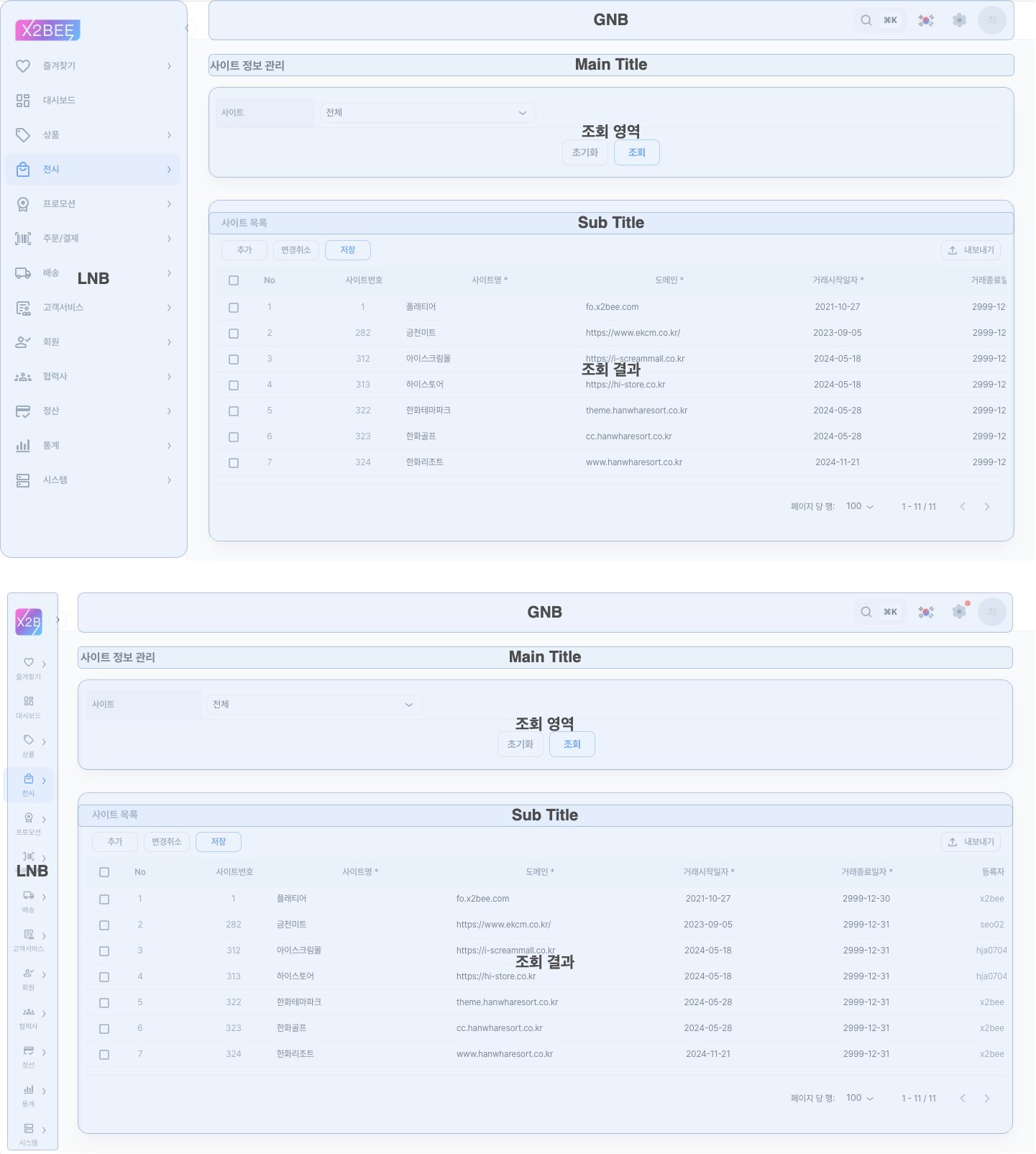
Sets a maximum content area for the screen as shown on various devices. Uses a bounded content area that keeps the same layout even as device size increases, applying a maximum value of 1200px. The layout is built on a responsive basis, and content is rearranged to fit the device size as the device shrinks.

![레이아웃-기본구성.png](https://tech.x2bee.com/download/attachments/525729859/%EB%A0%88%EC%9D%B4%EC%95%84%EC%9B%83-%EA%B8%B0%EB%B3%B8%EA%B5%AC%EC%84%B1.png?version=1\&modificationDate=1733726215215\&cacheVersion=1\&api=v2)

| Area         | Usage                                                                                                                                                        |
| ------------ | ------------------------------------------------------------------------------------------------------------------------------------------------------------ |
| Basic layout | Uses a three-way split structure of Top, Left, and Work.                                                                                                     |
| GNB          | Places components that provide menu search, settings, and user-information checks.                                                                           |
| LNB          | <p>Arranges and configures the full system menu information so pages can be navigated.</p><p>Provides a menu-collapse feature to free up more workspace.</p> |
| Work Area    | Made up of various components, and used to process the tasks of the menu.                                                                                    |

#### 3. Workspace Types <a href="#id-3" id="id-3"></a>

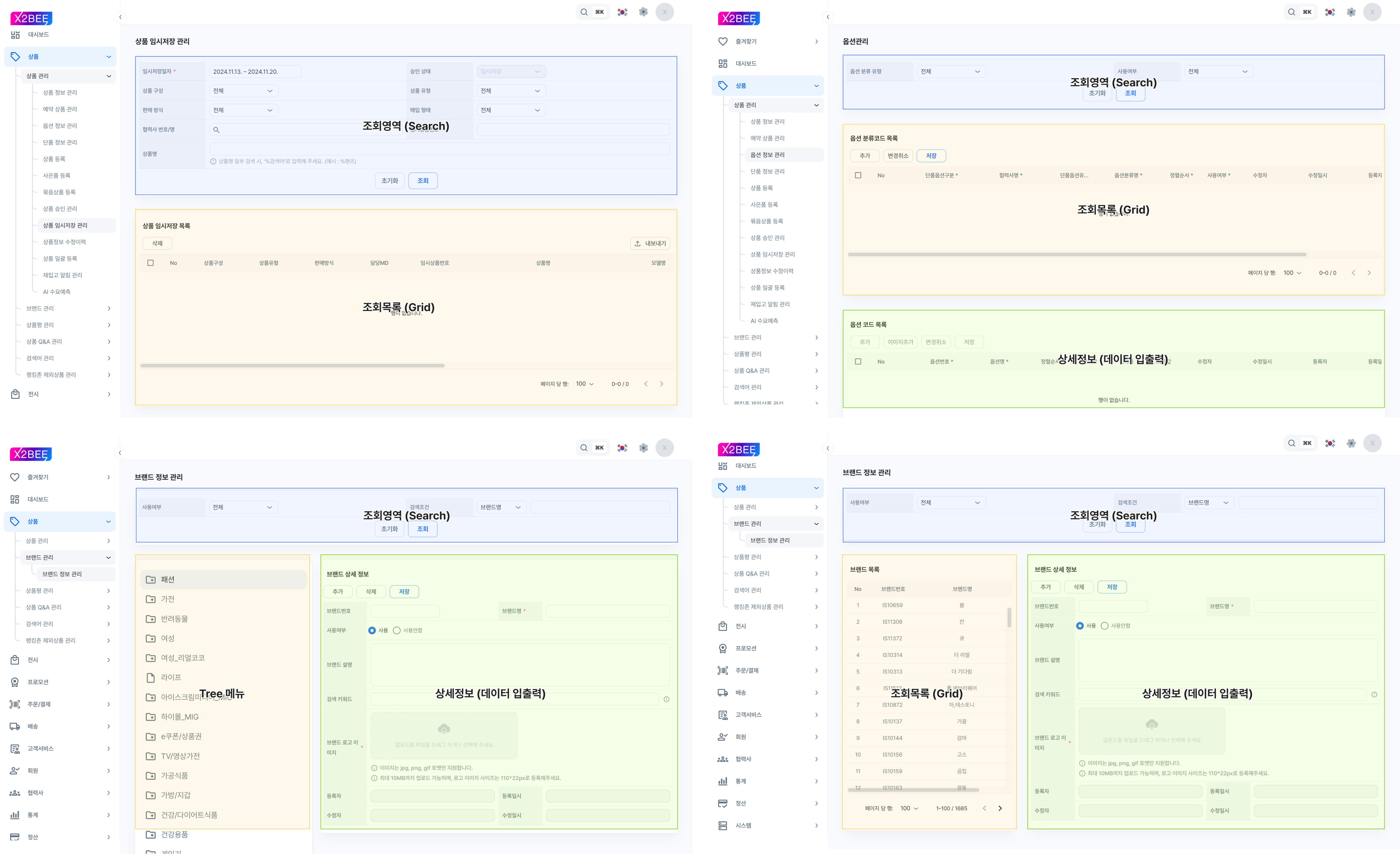
The workspace is provided in different types depending on the menu, broadly divided into 4 types. On mobile, it is built responsively and provided as a different workspace type, but must provide the same information as desktop.
<figure><img src="https://200425-files.gitbook.io/~/files/v0/b/gitbook-x-prod.appspot.com/o/spaces%2FVEZx3rsZsIv89GPS3d2J%2Fuploads%2FpoAfLKk88AUBlS9zW5Z6%2F%E1%84%85%E1%85%A6%E1%84%8B%E1%85%B5%E1%84%8B%E1%85%A1%E1%84%8B%E1%85%AE%E1%86%BA-%E1%84%8C%E1%85%A1%E1%86%A8%E1%84%8B%E1%85%A5%E1%86%B8%E1%84%80%E1%85%A9%E1%86%BC%E1%84%80%E1%85%A1%E1%86%AB.png?alt=media&#x26;token=e1cba0f6-85cc-43f7-bffb-310b90dd04d1" alt=""><figcaption></figcaption></figure>

#### 4. Spacing by Component <a href="#id-4" id="id-4"></a>

The content area within a page maintains the following spacing, and care should be taken with how the spacing changes from desktop to mobile size.

<figure><img src="https://200425-files.gitbook.io/~/files/v0/b/gitbook-x-prod.appspot.com/o/spaces%2FVEZx3rsZsIv89GPS3d2J%2Fuploads%2FmyjPuu4yGi0pb8QjFxP7%2Flayout%20%E1%84%8B%E1%85%A7%E1%86%BC%E1%84%8B%E1%85%A7%E1%86%A8%E1%84%80%E1%85%AE%E1%84%87%E1%85%AE%E1%86%AB.drawio.png?alt=media&#x26;token=e47f1c32-bf2a-4aeb-8190-a64832419588" alt=""><figcaption></figcaption></figure>

The workspace is divided into the menu-name area and the search/search-results area, and the spacing between content sections follows the table below.

| **Area**                       | **Desktop (based on 1200)** | **Mobile (based on 600)** |
| ------------------------------ | --------------------------- | ------------------------- |
| GNB                            |                             |                           |
| LNB                            |                             |                           |
| Heading-Body                   |                             |                           |
| Search and results area - Body |                             |                           |
| Search list button - Body      |                             |                           |
| Body - Footer                  |                             |                           |

***

### System Icon <a href="#system-icon" id="system-icon"></a>

#### Basic Rules <a href="#undefined" id="undefined"></a>

* Use SVG files
* Standard icon size is 24px; also use 16px, 18px, 20px, 32px, and 40px sizes
* Use Google Material Symbol/Rounded/400 by default

#### Usage Guidelines <a href="#id-1" id="id-1"></a>

* Distinguish between Line type and Fill type
* Maintain a consistent style for clear communication of information

***

### Button <a href="#button" id="button"></a>

#### Writing Rules <a href="#undefined" id="undefined"></a>

1. Button labels are written as nouns (\[Save], \[Confirm], etc.)
2. Button functionality is expressed centered on the user's action
3. Special-purpose buttons, such as AI features and multilingual support, are given a separate style

#### Usage Guidelines <a href="#id-1" id="id-1"></a>

* For popup or related-screen buttons, the target screen name may be designated as the button label
* Order execution buttons according to the screen's functionality

***

### Accessibility <a href="#undefined" id="undefined"></a>

* Meets WCAG 2.1 AA level standards
* Supports color contrast, text size, and keyboard navigation
