> For the complete documentation index, see [llms.txt](https://tech.x2bee.com/llms.txt). Markdown versions of documentation pages are available by appending `.md` to page URLs; this page is available as [Markdown](https://tech.x2bee.com/dev-guide/developer-guide-en/pjt-prepare/publish-your-docs/store-front-framework-next.js/03.-publishing-guide/2.-checkbox.md).
# 2. Checkbox
This document is a guide to applying an icon to a checkbox using a local icon.
{% stepper %}
{% step %}
### 1) Prepare the Local Icon
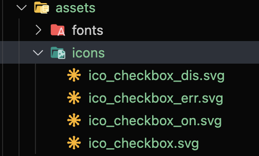
Save the icon to use for the checkbox in the `src/assets/icons/` folder. (The folder name is up to you.)
{% endstep %}
{% step %}
### 2) Configure tailwind.config.js
Add the backgroundImage as follows in `tailwind.config.js`. (Adjust the path and file names to match your project.)
{% code title="tailwind.config.js" %}
```
```
{% endcode %}
```js
theme: {
extend: {
backgroundImage: {
'icon-checkbox': "url('~/src/assets/icons/ico_checkbox.svg')",
'icon-checkbox-on': "url('~/src/assets/icons/ico_checkbox_on.svg')",
'icon-checkbox-dis': "url('~/src/assets/icons/ico_checkbox_dis.svg')",
},
}
}
```
Now you can use the icon image as a custom utility class (background-image).
{% endstep %}
{% step %}
### 3) Separate the CSS File and Import It
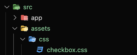
You could add this directly to `src/app/globals.css`, but for refactoring purposes, create a `src/assets/css/checkbox.css` file and import it in `globals.css`:
```
@import url('../assets/css/checkbox.css');
```
```
@tailwind base;
@tailwind components;
@tailwind utilities;
@layer base {
input {
@apply appearance-none;
}
}
@layer components {
.checkbox {
@apply mx-2 inline-block h-6 w-6 shrink-0 cursor-pointer bg-icon-checkbox bg-contain bg-center bg-no-repeat align-middle checked:bg-icon-checkbox-on disabled:bg-icon-checkbox-dis;
}
}
```
Explanation:
* The default Tailwind reset does not fully reset the input tag, so we reset it again with `@apply appearance-none;`.
* The `.checkbox` class uses the background-image utility configured earlier.
### 5) Example Usage in a Component
React (or Next.js) component example:
```jsx
const CheckBox = () => {
return (
);
};
export default CheckBox;
```
{% endstep %}
{% step %}
### 6) Result
#### local icons
Save the icon to use for the checkbox in the src/assets/icons/ folder. (The folder name is up to you.)
 #### config
Add the following code to tailwind.config.js.
```
theme: {
extend: {
backgroundImage: {
'icon-checkbox': "url('~/src/assets/icons/ico_checkbox.svg')",
'icon-checkbox-on': "url('~/src/assets/icons/ico_checkbox_on.svg')",
'icon-checkbox-dis': "url('~/src/assets/icons/ico_checkbox_dis.svg')",
},
```
Now you can use the icon image as a custom utility class.
#### css
You could add the code directly to src/app/globals.css,
but for refactoring purposes, create the src/assets/css/checkbox.css file,
and import it in src/app/globals.css.
`@import url('../assets/css/checkbox.css');`
Now back in checkbox.css, write the utility class defined above as follows.
And since Tailwind's default reset CSS doesn't fully reset the input tag, we reset it again here.
```
@tailwind base;
@tailwind components;
@tailwind utilities;
@layer base {
input {
@apply appearance-none;
}
}
@layer components {
.checkbox {
@apply mx-2 inline-block h-6 w-6 shrink-0 cursor-pointer bg-icon-checkbox bg-contain bg-center bg-no-repeat align-middle checked:bg-icon-checkbox-on disabled:bg-icon-checkbox-dis;
}
}
```
#### Example usage inside a component
```
const CheckBox = () => {
return (
);
};
export default CheckBox;
```
#### Result
#### config
Add the following code to tailwind.config.js.
```
theme: {
extend: {
backgroundImage: {
'icon-checkbox': "url('~/src/assets/icons/ico_checkbox.svg')",
'icon-checkbox-on': "url('~/src/assets/icons/ico_checkbox_on.svg')",
'icon-checkbox-dis': "url('~/src/assets/icons/ico_checkbox_dis.svg')",
},
```
Now you can use the icon image as a custom utility class.
#### css
You could add the code directly to src/app/globals.css,
but for refactoring purposes, create the src/assets/css/checkbox.css file,
and import it in src/app/globals.css.
`@import url('../assets/css/checkbox.css');`
Now back in checkbox.css, write the utility class defined above as follows.
And since Tailwind's default reset CSS doesn't fully reset the input tag, we reset it again here.
```
@tailwind base;
@tailwind components;
@tailwind utilities;
@layer base {
input {
@apply appearance-none;
}
}
@layer components {
.checkbox {
@apply mx-2 inline-block h-6 w-6 shrink-0 cursor-pointer bg-icon-checkbox bg-contain bg-center bg-no-repeat align-middle checked:bg-icon-checkbox-on disabled:bg-icon-checkbox-dis;
}
}
```
#### Example usage inside a component
```
const CheckBox = () => {
return (
);
};
export default CheckBox;
```
#### Result
 {% endstep %}
{% endstepper %}
{% endstep %}
{% endstepper %}

.png?alt=media&token=50ad9109-2a19-4004-8bc7-372355fffe8a)